

LIFE SIZE! This took me about a week, I wanted to use flat colours, because that's more my style of working, I used acrylics to paint it, and a stencil printed on acetate and cut out sections for a repetitive look. I didn't want a picture where I was just stood about looking ordinary, I wanted to make it more personal, this is a pose I do when I'm out with my friends so I thought I'd use it for my portrait.


This is a facial portrait we were asked to do after our lifesized ones, we had to paint our backgrounds green and paint our faces onto a green background, loads of people on foundation questioned it as if they've never heard of this technique to help draw out better skin tones etc. I used oil paints, as they give a much more realistic finished product and are easier to work with for this kind of task, rather than a media such as acrylic. I cut out my image and stuck it on white paper as it looked messy before.

These are the BEST markers I have ever used! Utterly fab, I got them for christmas, they give such a flat colour! Really good for my Graphics work.
Typography - Graphics:
I loved this project, utterly loved it. We had to come up with our own font, but I got a bit carried away and did more than one.

Simple font, filled with lines + shadowing.
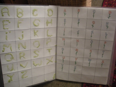
Dripped wax, alphabet on stems as flowers.

The first letter of a brand e.g Thorntons for "T", brand logos e.g Nike for "N"

Cats simplified and shaped (enlargement below), Geometric based.

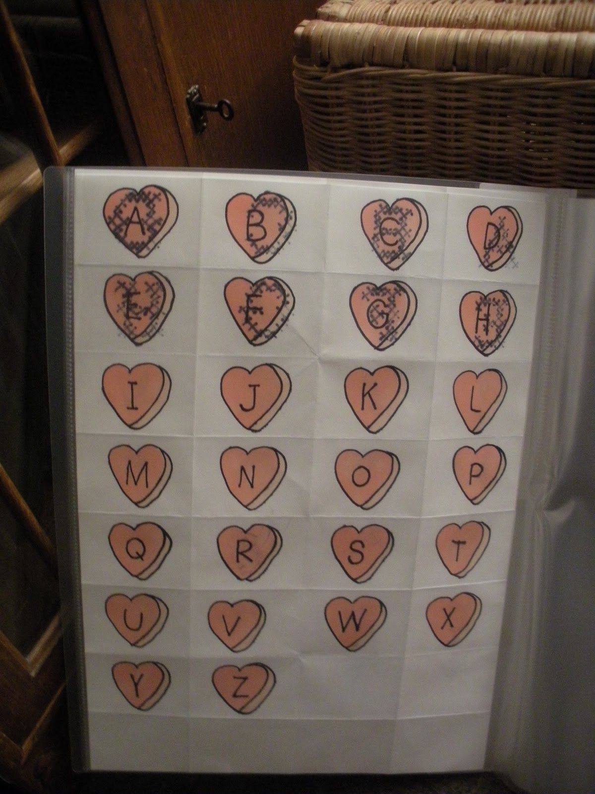
Hearts, re-did the hearts (below) because on the other side I'd tried to do a font based on cross stitching which showed through and more calligraphy based.


Bands e.g Alice Cooper for "A", can you guess who they all are (below)? Sketchy line drawn based font


MONSTER FONT!


Three layers of cardboard graduating into smaller layers

"Shaven Sheep"
No comments:
Post a Comment